 Sales are the main reason you’re able to stay in business. Yet shockingly, many yoga business websites make it incredibly hard for the new student (and existing one) to buy their services. Yes, that’s right! You could be leaving money on the table if making a purchase is challenging. And you’re actually pushing away potential clients instead of inviting them in. To combat these errors, use our 5 website tips to boost your sales today.
Yesterday, I was filming the final phase of our Launch your Yoga Business Online Course. Four lessons in this program are spent on crafting irresistible offers and pricing them strategically. Once your offers are in place, you can ask for the sale in clear ways.
To better help participants understand these concepts, I wanted to find website examples in the yoga industry—other than my own—that are utilizing these essential tips.
The findings shocked me! Many yoga websites were structured in a way that actually made it incredibly hard to complete a purchase.
And since my mission was research-based, I stayed on these websites far longer than a potential client would. With each click down the virtual rabbit hole, I found myself giving up. And likely many of your potential clients will, too, if you don’t implement these essential website tips right away.
Photo Credit: Ember and Earth Photography
THE 10-SECOND TEST
Believe it or not, researchers show that visitors make a crucial decision to stay on a website, or leave it, within 10 seconds. This means you want to make a bold impression and clear impression immediately! So ask yourself,
- “What’s going to pique the interest of my visitors?”
- “Which elements of my website will encourage people to stay? And actually buy?
- “How can I express myself uniquely and succinctly to make a good first impression?
The five website tips below are a great place to start.
TIP 1: MAXIMIZE YOUR IMPACT ABOVE THE FOLD
In the early days of publishing, ‘above the fold’ was used as a term to describe content on the top half of the front page of a newspaper. This valued section was visible when papers were folded and neatly displayed on the newsstand.
Today, the term transfers to the digital world. ‘Above the fold’ refers to the visible content on your website when someone first lands on your home page. It’s important because the content here sets the stage for the rest of a visitor’s website experience. And, you want to make sure you include these elements when designing your website.
Here’s the content you most want in this section:
A Noticeable Header
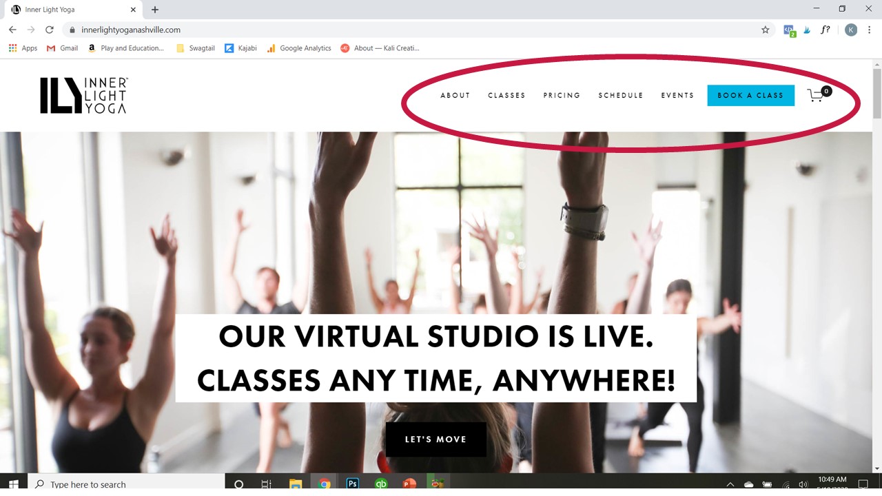
The header refers to the very top of your website and usually contains:
The company logo and/or business name: Ideally, this is simple to read, spell, and say out loud.
A Navigation Bar/Main Menu: These are the words you use to direct visitors around your site. While it can be fun to use clever terminology and inside yogi language, it’s better to be specific and straightforward. Think words like Services, Class Schedule, About, and Contact!
A clear Call to Action (CTA): This could be like “Buy now,” or “Reserve your Place.” Basically, this is assertive communication at its finest!
An announcement Bar: This is the top menu bar, above the main menu that often has the most relevant information and offers for your students. On Swagtail, it’s an invitation to join our free webinar. Remember, this should be simple and straightforward. Ideally, it’s a call to action for your students. Or it’s the most important message you want your clients to hear, like “Grand Re-Opening Special on June 1!”
A header is also likely to include the following:
- Search capability
- Shopping cart
- Login button for members, or
- User profile link
Space below the Header
Below the header is usually an image, slider, or video that captures the attention of your visitor. This is your chance to show your style and vibe of your yoga business. While the images can speak a thousand words, it is actually the text you put in front of those visuals that matter most.
This is where you want to have an obvious statement of what your yoga business provides to clients. Basically, you want to highlight how your yoga business makes life better for your students. And, you definitely want to have call-to-action (CTA) buttons in this section as well.
Keep in Mind…
There are two types of calls-to-action (CTAs)—Transitional and Direct. Transitional still uses direct language, like “Read our blog,” yet it’s an invitation to engage in a low-risk way. Direct CTAs involve more skin in the game, like “Buy now,” or “Join a Class.” And you can definitely use both on your website!
TIP 2: STRATEGICALLY PLACE YOUR INFO
Instead of splashing those important elements randomly above the fold, you want to place them in strategic places. This is based on how you commonly read a website.
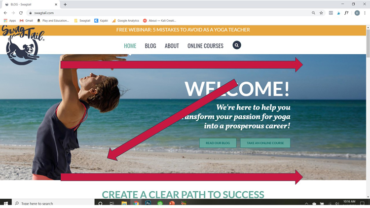
You either read in a “Z” pattern.
Or, you read in an “F” pattern.
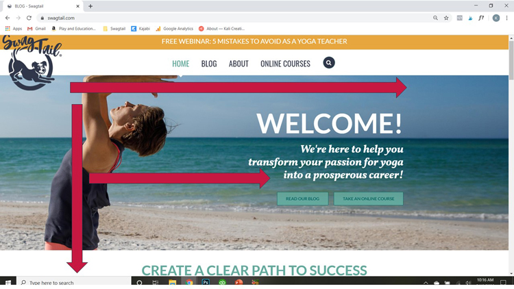
In either case, you want to make sure that readers instantly know what you do upon arrival,, and how your business helps improve their lives (or solves their problems). Make sure that they know exactly which steps to take right away. This involves using clear call to action buttons in the top-right corner and/or the center of the page.
TIP 3: TELL VISITOR EXACTLY WHAT TO DO
Usually people follow where they are led. And since you are their trusted guide as they visit your website, you want to make their experience as enjoyable as possible. In addition your clear value proposition and call-to-action buttons, you want to have a plan for them to follow.
Have a Plan
You appear confident and organized in the minds of your potential and existing clients when your website outlines a simple plan. This plan is designed to outline how they can work with your business. You can also give them specific steps that lead to a sale. It could be something as simple as:
- Find a class that fits your schedule
- Buy now to save your seat
- Hop on your mat and enjoy the class!
Or, you could say:
- Pick a Yoga Topic that interests you
- Check our Workshop Schedule
- Enroll now to expand your yoga knowledge
You want your plan to be straightforward and easy-to-follow. Think three or four steps in length; maximum. The goal is to eliminate any guesswork for your website visitors. You want to remove any potential confusion by your clients, and instead inspire them to act with confidence.
Pro Tip
If visitors aren’t ready to buy, you can still have simple action steps to follow that allow them to get to know more about you or your business. In exchange for their email address, you provide something of value that actually helps them right away. This might be a PDF or intro video series. In any case, it’s a first step of building trust in a new relationship. And, it means they give you permission to share more about your business with them via email.
TIP 4: PRESENT CLEAR OFFERS
An offer is anything you are selling to your students. This includes services, which are the intangible items you sell such as your yoga teaching skills. When presented as an offer, your services often look like:
- Private yoga sessions
- New Student Specials
- A 10-Pack (of yoga classes)
- Monthly memberships
- Weekend workshops
You could also be selling products. These are tangible offers, such as yoga mats, props, water bottles, and branded yoga gear. Below is an example from UpYoga in Minnesota, who is already using these website tips beautifully in many ways. Even if you’re not a studio, you could present your offers clearly in a similar way.
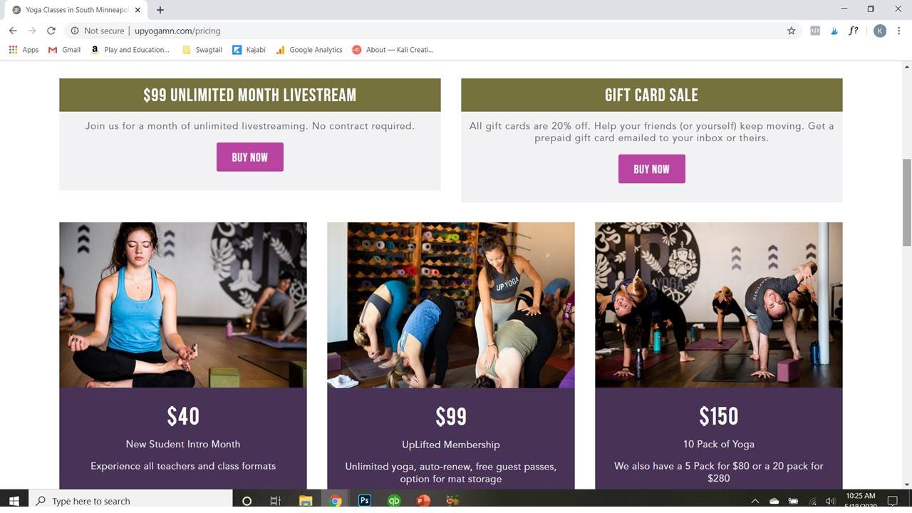
In order to present a truly irresistible offer, though, you need to include six components:
- A Clear Name for the offer
- An Offer description (that focused on the problems solved with the offer and benefits received from purchasing it)
- A Visible price point
- An Expiration Dates (or other instructions that come with services)
- A Guarantee and/or Refund Policy
- An Easy way to pay. This last item is so important, we’ll talk about in website tip #5 next.
TIP 5: SIMPLIFY THE SALES PROCESS
Even when you have the first four website tips above in play, you want to make sure the purchase process is as seamless as possible for your customer.
As I did my research yesterday, I noticed many yoga businesses had some of these elements clearly laid out. That’s a good thing. Yet even on the sites that did have this right, they often made the purchase process confusing by sending the visitor to a general MindBody storefront for the yoga business. I then had to read down the entire list of services to select the correct class pack I would like to purchase.
When there are more hoops for your potential clients to jump through before buying, you’ll often lose the sale. As the saying goes,
“If you confuse the client, you’ll lose the client.”
♥
Don’t risk making the checkout process harder for your students and risk forfeiting the sale entirely. Again, keep the payment steps simple and use payment formats that are familiar and trusted by most.
One more Note
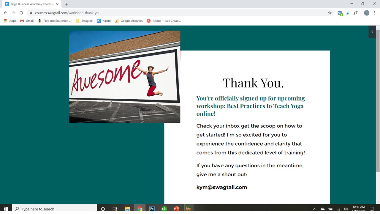
Please note that once a sales is complete, direct the client to a “thank you” page. This is a kind way to confirm their purchase was successful. You can also invite them into your community and give them important instructions about what to do next. A digital receipt and welcome email are additional ways to stay at the top of your game as a yoga professional. This increases trust with your clients from the get-go.
PUTTING IT TOGETHER
So often I hear that yoga studios and yoga professionals are struggling. And while it might seem like a global pandemic is easy to blame, the truth is that the websites of many yoga businesses make it hard for sales to take place. They confuse potential clients, make purchases challenging, and leave money on the table. Instead, you now have the power to use these essential website tips to skyrocket your sales (and give some much-needed oxygen to your growing business).
Take Action Now:
- Do a website audit. Open your own website in a new browser window, and use the checklist items above to make sure your website is really working for you (instead of against you).
- Join the wait list for our Launch your Yoga Business Course. Whether you’re just starting out, or looking to refine your business coming out of this pandemic, this 6-week course will give you the exact tools to thrive as a yoga professional.




Leave A Comment